Write Mobile Device specific code using jQuery

To make their life easy in this post, we are going to see how to write conditional CSS/JavaScript code based on mobile device operating system using a jQuery plugin. Earlier I had posted about 10+ Best and Free jQuery Mobile Themes, Awesome jQuery Mobile Plugins, Detect Mobile Browsers using jQuery and Detect Android Devices/Phone using jQuery.
There is a jQuery plugin called Device.js which makes it easy to write conditional CSS and/or JavaScript based on device operating system (iOS, Android, Blackberry, Windows, Firefox OS), orientation (Portrait vs. Landscape), and type (Tablet vs. Mobile) of device.
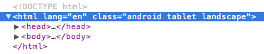
This plugin based on the device operating system, automatically updates the <html> section with appropriate css classes. See below image.
For iPhone

For Android Tablet
Current following devices are supported,
- iOS: iPhone, iPod, iPad
- Android: Phones & Tablets
- Blackberry: Phones & Tablets
- Windows: Phones & Tablets
- Firefox OS: Phones & Tablets
All you need to do is to just include the script. And that's it.
<script src="device.js"></script>
This plugin provides different set of CSS Classes as well as JavaScript function for every mobile operating system. To find out all available Javascript methods and more about CSS classes list you can visit its home page on github..
Feel free to contact me for any help related to jQuery, I will gladly help you.